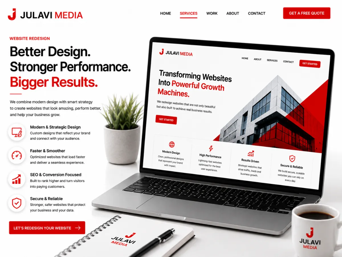
We get some version of this question every month: “Is it time to redesign our website, or are we just bored of looking at it?” Those are two very different problems, and mixing them up is how businesses end up spending real money on a prettier site that converts exactly as poorly as the old one.
Signs it's actually time
A redesign is a business decision, not a design preference, when you're seeing:
- Rising bounce rate on key landing pages — especially on mobile, where a slow or cluttered first impression costs you before anyone reads a word.
- A conversion rate that hasn't moved in years despite steady or growing traffic — the site is a leak, not a lever.
- A site that doesn't reflect what you actually sell today. Businesses evolve; a lot of sites are still selling the 2019 version of the company.
- You're embarrassed to send prospects to it. If your own sales team avoids linking to certain pages, that's a signal worth listening to.
- It's technically fragile. Every content update requires a developer, or the site breaks on a phone released in the last two years.
Signs it's not actually time
Sometimes what looks like a redesign problem is really a much cheaper fix:
- A slow site is often a hosting or image-optimization problem, not a design problem.
- Low traffic is an SEO or ads problem — a new coat of paint won't fix a site nobody's finding.
- “It looks dated” is subjective and rarely, on its own, worth a full rebuild if the underlying structure and conversion paths are solid.
How to redesign without losing what's working
The costliest redesign mistake we see is treating it as a blank page. Before a single new mockup gets built, we pull:
1. An audit of what's actually driving results today
Which pages get the traffic, which convert, which rank. Anything performing well gets preserved or improved — not rebuilt for the sake of it.
2. A real look at information architecture
Most “dated” sites aren't actually a visual problem — they're a findability problem. Users can't get from the homepage to the thing they came for in a reasonable number of clicks.
3. A migration plan for SEO equity
Every URL that currently ranks needs a 301 plan before launch, not after someone notices traffic dropped 40% the week after go-live. This is the single most common redesign disaster, and it's entirely avoidable.
4. A design pass built around conversion, not decoration
Modern visual design should serve the same handful of goals every page has: get the right message across fast, build enough trust to keep scrolling, and make the next step obvious.
A redesign that loses your search rankings and your best-converting pages isn't a redesign — it's a rebuild of the same problems in a nicer font.
What “right” looks like
A well-run redesign should launch with equal or better organic visibility than before, a measurable lift in conversion rate within the first two months, and a site your team can actually update without calling a developer. If a redesign proposal doesn't address all three, it's a design exercise — not a growth investment.